Sometimes less is more. In the case of design, choosing the minimalistic path can be a trendy choice. While these designs aren’t minimalistic in design, they are single color, a trend projected for wine 2016.
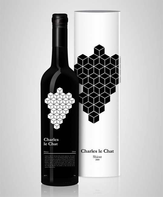
Charles Le Chat Designed by Victor Eide
Charles Le Chat Designed by Victor Eide
While monochromatic design can sometimes be classic, this geometric image brings the packaging right into the modern world. The text on the bottom of the bottle is so subdued that the focus is drawn in by the cubes, leaving the customer to pick up the bottle to find out more.
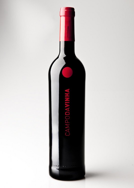
Campodavinha Designed by Rita Bastos
Campodavinha Designed by Rita Bastos
Simple, but effective. This label draws the eye in, not in spite of, but because of the lack of flash. After one glance, the customer knows the name of the vineyard, and after a second glance, they’ll surely be reaching out to pick up the bottle.
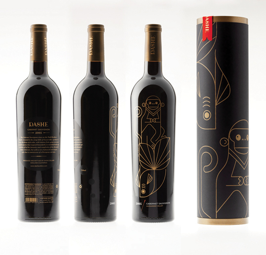
Dashe Single Color Wine Design by Jenny Pan
Dashe Designed by Jenny Pan
Pan opted to include a whimsical tone in designing her Dashe wine label. The use of single color (with the exception to the small amount of red included on the packaging and bottom of the bottle’s pressure-sensitive label) provides the design with a unique and stylized look.
Are you interested in learning more about how our labeling solutions can increase sales? Download The Complete Guide to Innovative Labeling Techniques.
Connect with us on social media!
![]()
![]()
![]()
![]()
![]()
![]()
![]()
![]()