A transparent stock is a common and valuable tool in label design. For food packaging, it provides a window for customers to see the product. It’s not limited to the food industry, however. Even if the package is opaque, the transparent label draws the customers eyes to look right where the brand wants them. Create a strategic design as well as a beautiful one.
Highlight What’s Important
In the case of these Silver Spring labels, they use transparent stock to draw the eye in toward the logo. Floating outside of the border is the size information, but it doesn’t even register at first glance. This draws the customer toward the brand name and product name. This is arguably, the most important information.
This also creates the appearance of a unique shaped label. While the label is still square, and can easily run through applicator systems, it gives the illusion of a more complex border. Use this simple trick to compliment the shape of our packaging while maintaining ease in label application.
Minimalism is a Classic Aesthetic For Transparent Stock
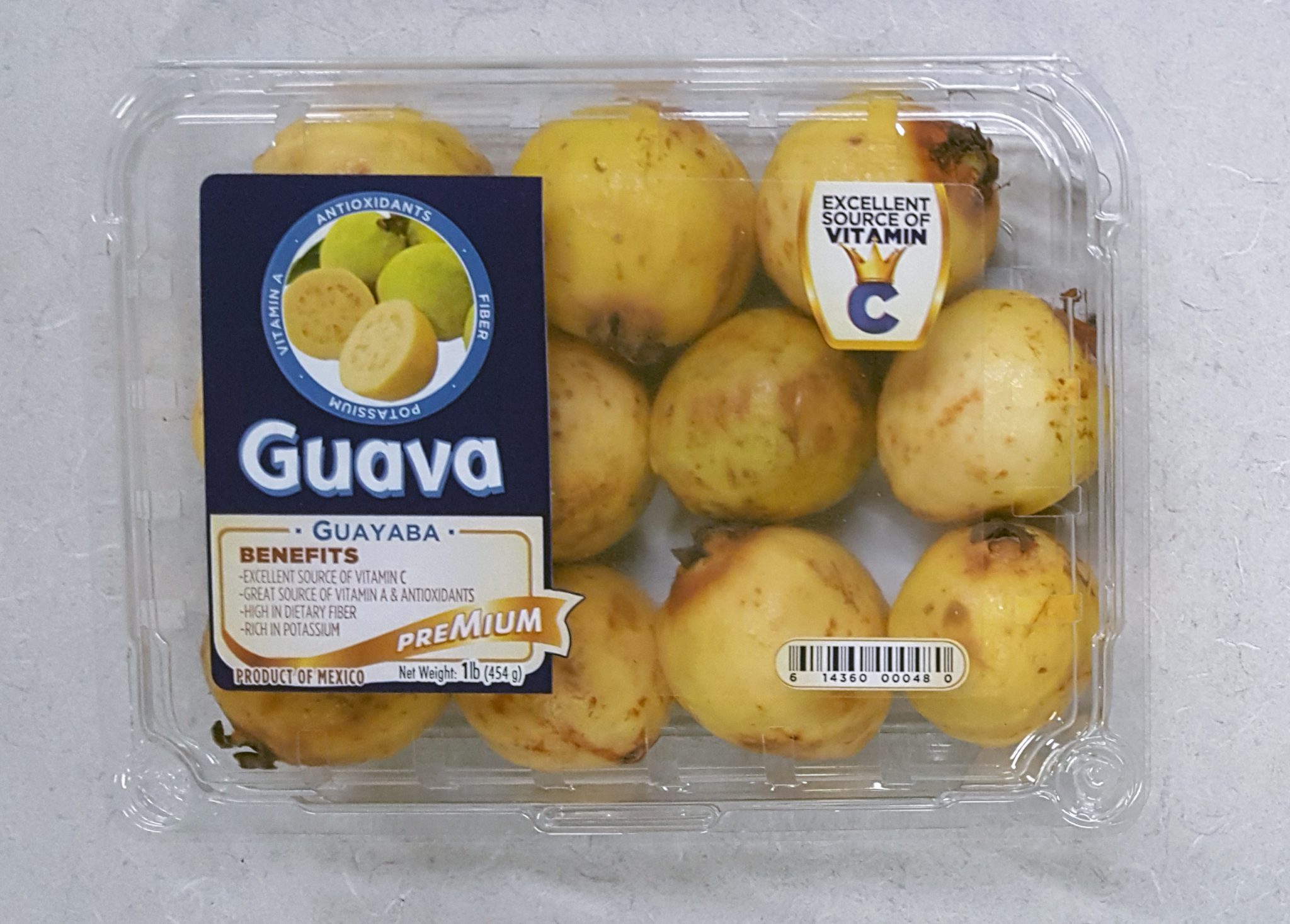
Although the above Premium Guava example isn’t a truly minimalistic design, it has minimalistic qualities. A large portion of the label is transparent which offers customers a look at the product inside. This eliminates much of the space for information or graphics. Instead, information and imagery are bolder, easier to read, and eye-catching.
Much of the information is found on a secondary label underneath the product. This ensures that design is a top priority for the main label. It makes items like barcodes easy to find as well.
Create a 3D Look With Front & Back Labels
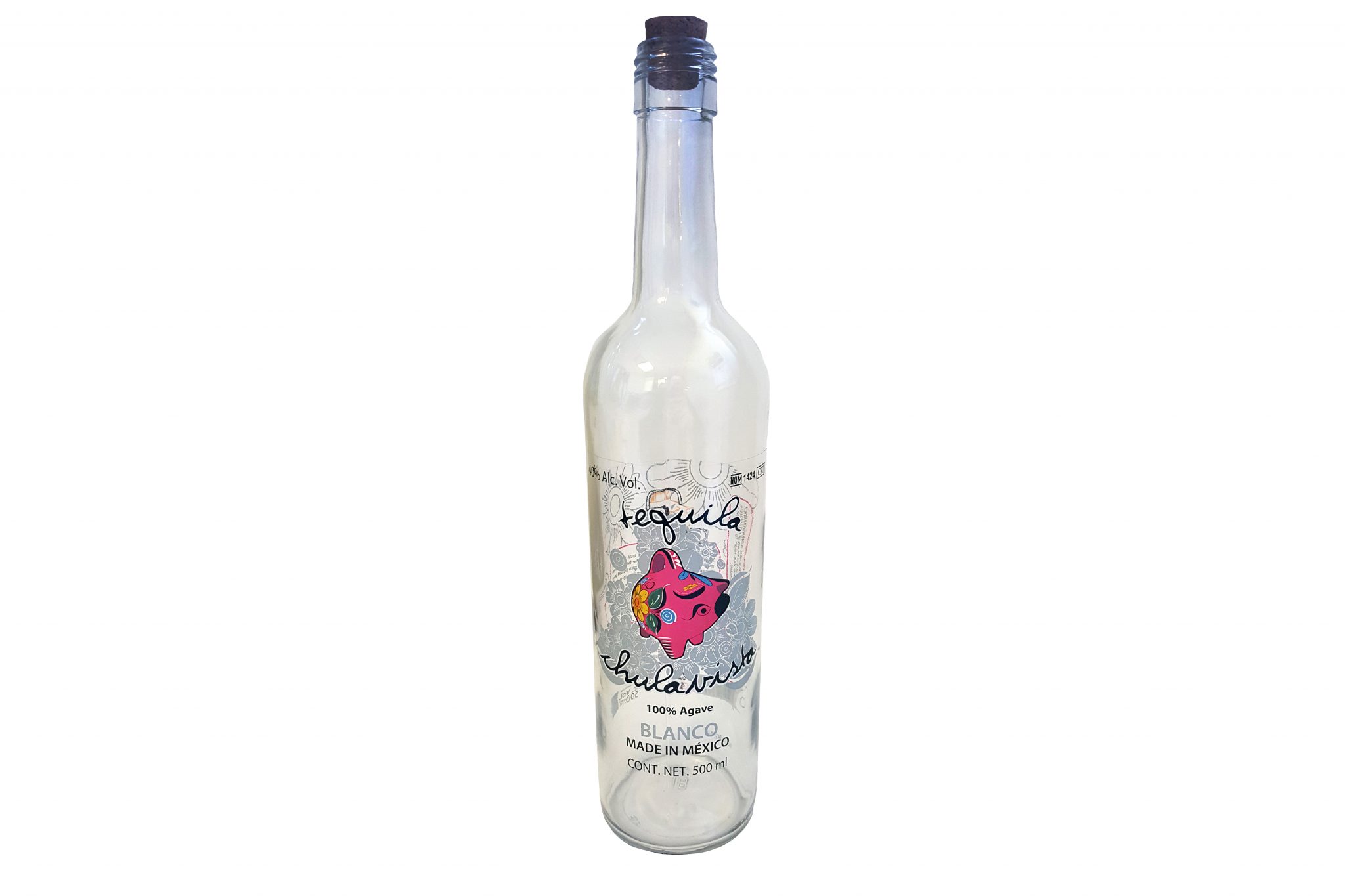
With a clear product, like tequila, transparent labels offer the opportunity to create a three-dimensional look. The back label peeks through the front. This makes it seem like there are more dimension and texture in the design.
With the above design, the pattern on the back comes through to the front. The vibrant pig motif is then complemented by the muted pinks and oranges coming through from the back. If the front label was a black and white label, the color on the back would add even more pop.
The Importance of Contrasting Colors
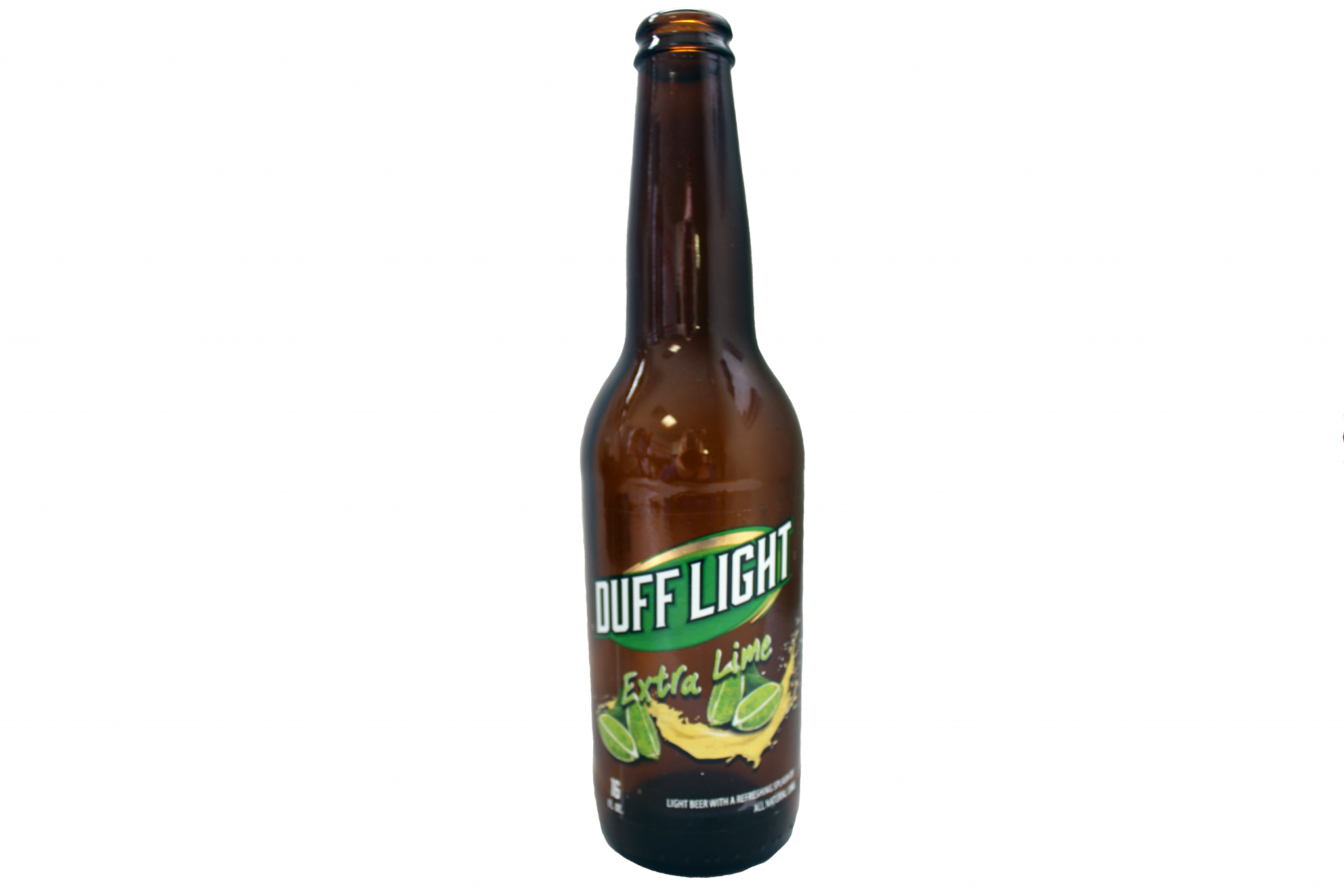
Dark packaging, or dark products (like this beer bottle), pop with transparent labels using bright, vibrant colors. The gold Mirafoil contrasts the dark amber bottle. The lime green and bright yellow also pop because of the amber surrounding the motifs. When full, the beer within adds depth to the packaging overall.
Learn more about how we can bring your wildest label design concepts to life. Download our Label Project Guide e-book.
Connect with us on social media!
![]()
![]()
![]()
![]()
![]()
![]()
![]()
![]()