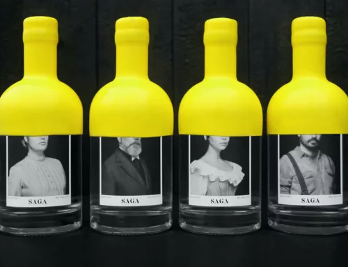
Australia’s decision to use plain, brown packages for cigarette packaging to deter smokers re-ignites an interesting conversation to choose colors with impact. What best suits your packaging and also compliments your brand? Thanks to social conditioning and even natural associations, colors have a big impact on label design. The below graphic highlights what colors to use depending on the area of your business.
Time To Choose Colors

Use the above graphic to choose colors best associated with your product. The answer may have surprised you, or perhaps you disagree completely.
So, about brown packaging discouraging cigarette purchases…
So, this isn’t the be all and end all of the color association, however, it does instead provide a lot of valuable insight into design. What’s funny is that this graphic shows that brown also makes people think of delicious food. That’s certainly not the message the Australian government is trying to send with deterring smokers.
This raises an interesting question. Can color association vary person to person, upbringing to upbringing? That’s a likely possibility. Of course, testing and gathering feedback is a valuable tool in getting valuable insight, targeting the direction of your product’s design.
Learn more about designing effective, professional grade labels that wow customers and even increase sales. Download our Label Project Guide.
Connect with us on social media!
![]()
![]()
![]()
![]()
![]()
![]()
![]()
![]()