Free fonts alleviate budgetary strain when designing labels. Whether revamping a tired aesthetic or starting from scratch, fonts make a big impression on shoppers. While you browse fonts, also consider how innovative techniques will improve the look. Especially for textured fonts, adding realism and eye-catching techniques such as foiling increase the haptic nature of your packaging and draw customers’ attention.
Labeling Principles To Know Prior To Downloading Fonts
If you’re new to design, make sure you understand the principles before getting started. A great font does wonders for your packaging design, however, so does other elements. One false step and the entire aesthetic of the product is undermined.
- Common labeling mistakes to avoid
- 13 labeling factors to consider before your design goes to print
- The importance of color impacts potential e-commerce
First, take note of any restrictions before using free fonts.
Oftentimes fonts on the following websites come with attribution requirements or are only available for personal use. Double check these qualifiers before making the leap of downloading. Free is great, but fair is better.
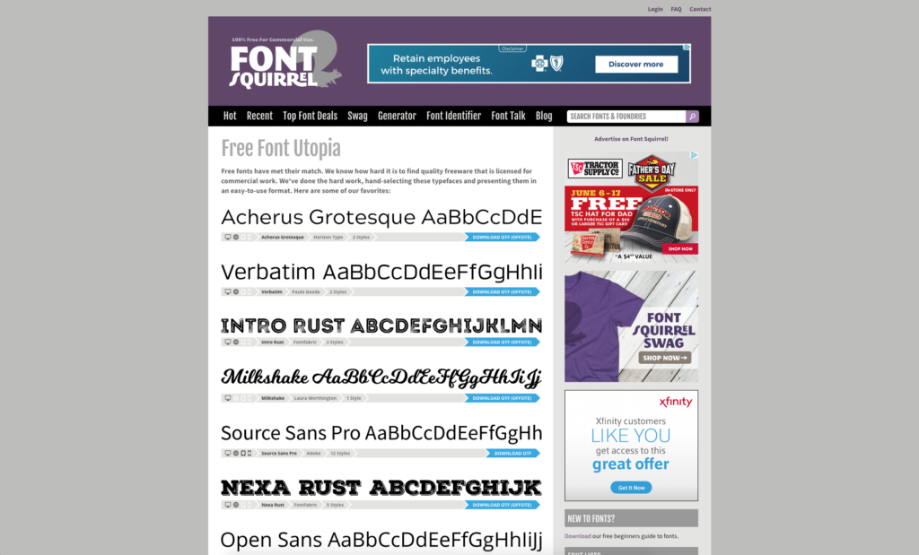
5. Font Squirrel
Although the range of selection is smaller than other sites, Font Squirrel offers a highly curated selection of professional grade fonts. It also offers straightforward navigation and a priceless font identifier tool. So, for old labels, you may not even have access to the font files any longer. Instead of starting fresh, Font Squirrel provides help with identifying the old font and linking you to the download page. No more mindless searching, and no need for redesign if that’s not your desire.
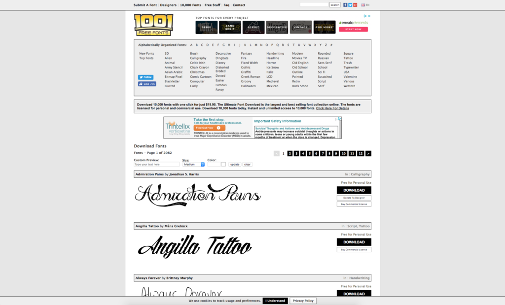
4. 1001 Free Fonts
This is a classic website with fonts categorized by theme and utility. So, labels with distinct flare, this makes it even easier to find fonts that match the theme. A cohesive look is crucial to communicating brand values after all. As you can see on the right side of the page, the site also makes attribution requirements and designer needs easy to find.
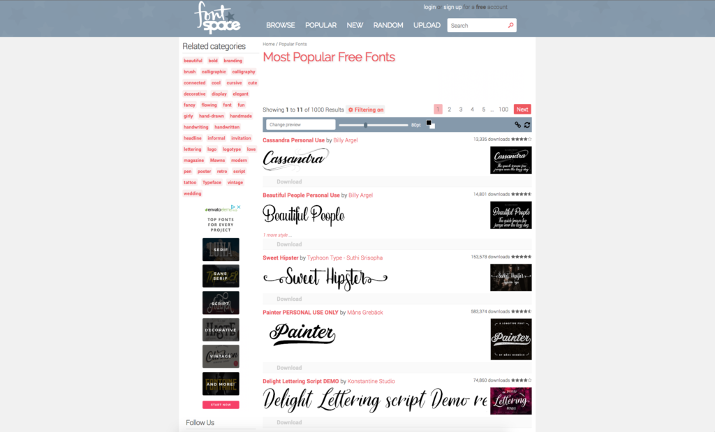
3. Font Space
Need a more visual platform? Font Space has you covered. This site shows each font used in sample images, seen on the right side of the page, which makes it easier to envision it on your label. Each font page also showcases a wide range of reviews which again make it easy to understand the flow of the font before downloading it.
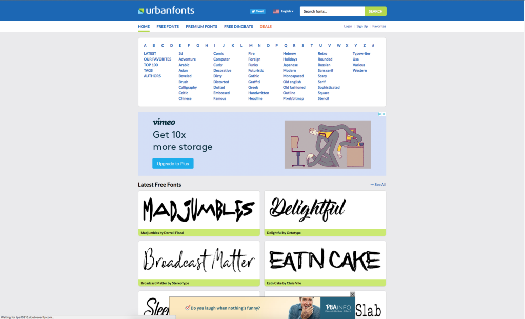
2. Urban Fonts
The modern, clean design of the website lends itself to easy navigation. It also makes sense that facebook linked reviews of each font are found on each font’s page as well. Luckily, many fonts have a plethora of reviews making it easy to get an unbiased view of how the font actually performs during the design process.
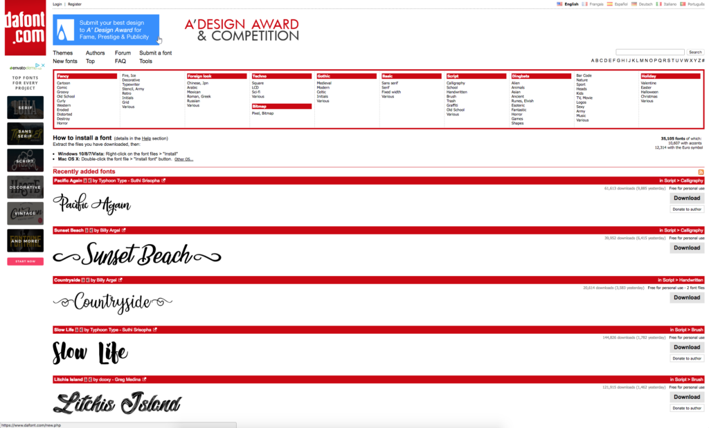
1. DaFont
DaFont is a classic, reliable portfolio. It offers a wide range of fonts and is neatly categorized at the top of the page. As you can see, it also offers a wide range of specific categories which narrows down font options to the best of the best for your needs. This website also makes it easy to discover the user requirements as set by the font designer.
So, what else is out there for label design on a dime?
Now you’re ready to move onto other elements of your design. From standard design principles to extend the life of your label, to images, save money on other packaging elements before your label prints. Before you know it, you’ll have affordable labels that even outshine your competition too!
- Free stock photos and product photography
- Low-cost design options
- Create a label that also stands the test of time
Learn more about what Great Lakes Label offers and how to incorporate various techniques into your label design. Download our e-book, Complete Labeling Solutions.
Connect with us on social media!
![]()
![]()
![]()
![]()
![]()
![]()
![]()
![]()