It’s hard to deny that adding foil details to your label also adds a level of sophistication and brand appeal. Many labels stick with the classic gold and silver foil, but today we’re instead looking at packaging that explores the color wheel when using foiling.
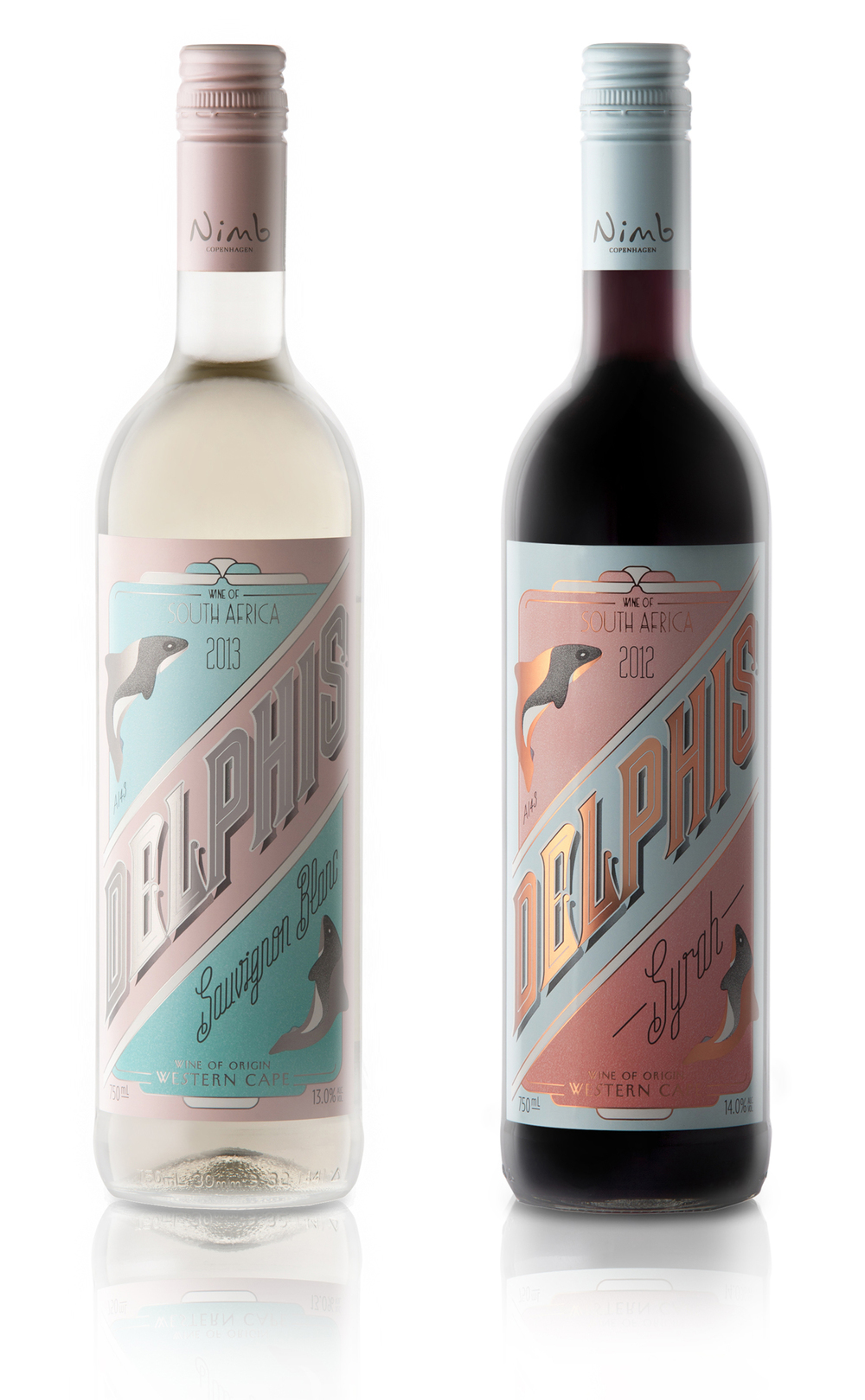
Pearly Yon Wine Label With Bronze Foil
Delphis Wine Label Designed By Pearly Yon
In addition to clearly paying homage to the art deco era, this bottle label showcases unique bronze foiling. The pastel pink and blue perfectly compliments the inclusion of bronze, suiting both the era of inspiration and the overall color scheme. Wines, in particular, can tend to take a heavily monochromatic route with design, but Pearly Yon proves that color and sophistication can go hand in hand.
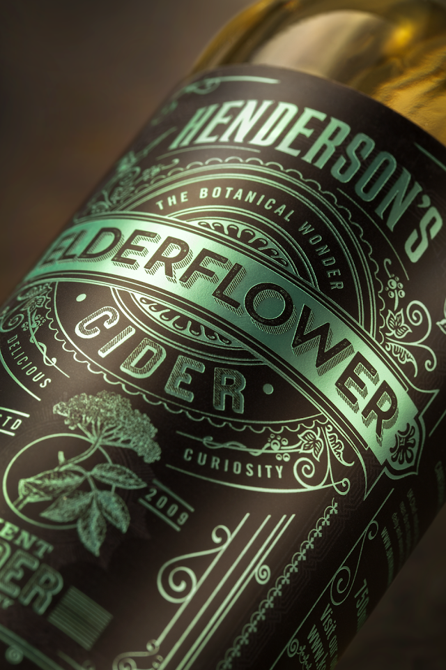
Cider Redesign With Green Foil
Henderson’s Cider Redesign by Sean Harvey
While taking a traditional Victorian-era design style, the foil on this cider label is anything but traditional. This shade of green isn’t a typical color chosen for foiling and as such, stands out in a crowd. The fact that this technique is showcased so prominently all over the label and is the only source of color makes it an incredibly unique packaging design.
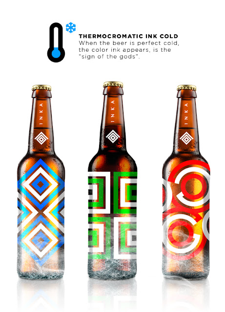
Inka Beer Design With Various Colored Foil
Inka Foil Beer Design by JP Branding
Not only does this label feature colorful foiling, but it’s also temperature sensitive. The shades increase their brightness the colder the bottle, making this a fun, interactive label. Colors tend to get bolder as the weather gets warmer. This poolside beverage certainly won’t get lost in the shuffle.
Learn more about how our labeling solutions can increase sales. Download The Complete Guide to Innovative Labeling Techniques.

Connect with us on social media!
![]()
![]()
![]()
![]()
![]()
![]()
![]()
![]()