Fonts are important. Although this is stating the obvious, there are ways to elevate your brand with the font used on your labels. Whether your design is minimalistic, or vibrant and bold, pay attention to what your font says. Not just the words used, but how the style fits with the overall aesthetic. Whatever it’s communicating needs to align with your product and your brand.
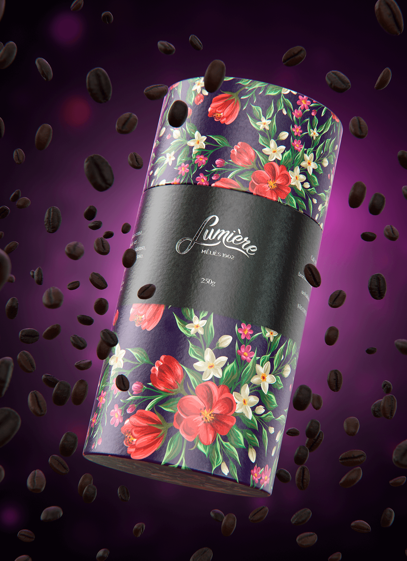
Lumière by Lucas Gregorio and Jáder Souza
Lumière Coffee Packaging With Foiled Font Designed By Lucas Gregorio and Jáder Souza
The calligraphy font used for Lumière pairs well with the beautiful, painted floral design used on the rest of the packaging. The foiling used over the title also fits since it implies handcrafted luxury. Due to the spacing, accompanying sans-serif fonts, and sizing of both the title and subtitles, the eye is drawn straight to the product name.
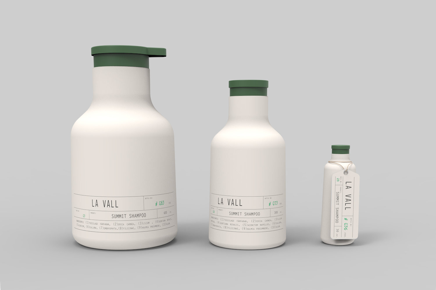
La Vall by Endika Gómez de Balugera, Pablo Berges, and Sofía Cuba
La Vall Beauty Line Labels Designed By Endika Gómez de Balugera, Pablo Berges, and Sofía Cuba
This beauty line uses very different techniques to execute the handcrafted implications through label design. La Vall features minimalistic labels with sans-serif font that creates a simplistic aesthetic. It implies the product itself uses simplicity, perhaps even organic, ingredients to achieve beautiful results. One way to enhance the design would be to emboss the text or use a tactile coating to create depth.
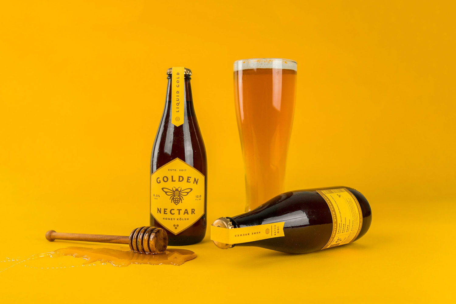
Golden Nectar Beer by Christopher Caldwell
Golden Nectar Beer Label Designed By Christopher Caldwell
Beer design is over-saturated with bold, almost aggressive design. Golden Nectar scales things back to create a focus on the font. While the color is vibrant and the graphics are bold, it still offers a handcrafted look while keeping its design sophisticated. All labels allow the font take center stage which makes it even more important the font conveys the branded message. Should designers want the simplicity and elegance of a label like this, but the bold standard of other beer labels, they have metallic stock as an option.
Learn how to use marketing strategies to create labels that will delight customers! Download our e-book, The Marketing Guide here.

Connect with us on social media!
![]()
![]()
![]()
![]()
![]()
![]()
![]()
![]()