This week we are looking at how foliage in label design. It’s one of autumn’s most prominent motifs, and it also draws the eye across the label in a natural way. Whether delicate or bold, leafy details can be used to draw attention.
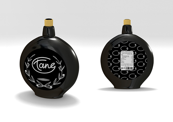
Tane Natural Olive Oil Label Design by Deniz Dayioglu
Tane Label Design by Deniz Dayioglu
This label features angular, minimalistic foliage that frames the name of the product. It is a subtle and sophisticated way to draw the eye. This dark label is designed without color and still, makes a strong impact on the viewer. Sometimes simpler is better. In this case, the label takes advantage of the minimalism trend too. The leaf pattern draws the customers’ eyes exactly what the designer wants.

Allen’s Apple Juice Redesign By Sara Panchaud
Allen’s Leafy Apple Juice Redesign by Sara Panchaud
Thisreconceptualized label removes visual clutter and updates the artistic aesthetic. The colors are more muted than the original and utilizes minimalistic leaves. This new packaging design reimagines the country home feel. Even the off-white background is a major departure from the dark blue of the original. This new look would make customers’ do a double take.
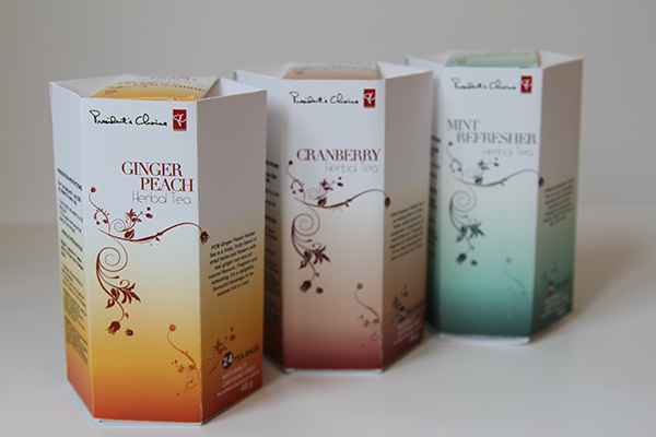
Foliage Oriented President’s Choice Tea Packaging By Nicole Audet
President’s Choice Foliage Centric Tea Packaging By Nicole Audet
This delicate design compliments the product in a very modern way. The simple, open concept design allows for the foliage design to lead the eye across the label. It points to information on other panels and urges you to pick up the package for a closer look. This is a brilliant tactic for getting the customer to read the company bio or ingredients list.
Learn even more about how our labeling solutions can increase sales. So, download The Complete Guide to Innovative Labeling Techniques.

Connect with us on social media!
![]()
![]()
![]()
![]()
![]()
![]()
![]()
![]()