These hair care labels move away from bold color schemes and instead into natural, modern looks. When using natural ingredients, this can be especially important. Use these creative touches to inspire your own label design.
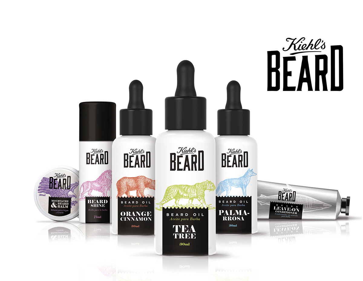
Kiehl’s Beard Products Designed By Lina Yucumá Carvajal and ElisavaPack
Kiehl’s Beard Products Designed By Lina Yucumá Carvajal and ElisavaPack
Inspired by the “wild side” of hair, this stylistic choice helps customers connect the dots between the wild animals to taming their beard. On top of that, the varied animals and colors for each product create identifiable scents. Better yet, the colors match the scent. Should the line expand with new scents, there are plenty more animals to choose from as an added bonus.
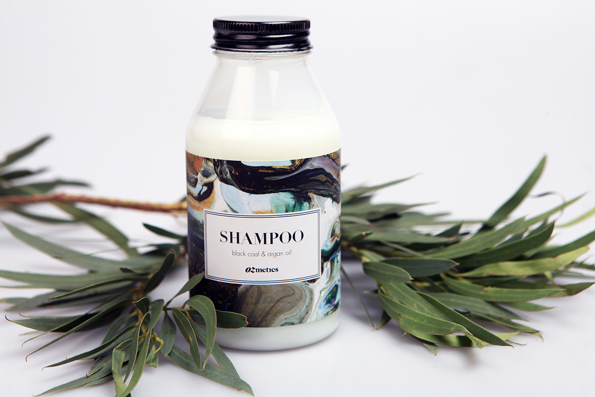
Ozmetics Packaging Designed By Sara Ozvaldic
Ozmetics Packaging Designed By Sara Ozvaldic
This label design project uses neutral marbling to communicate the natural focus of the branding. The serif font and simple double lined border gives a sophisticated touch and contrasts the fluid motion of the marbling nicely. The glass bottle creates a unique and retro aesthetic that shampoo bottles don’t use. It’s a fantastic way to imply this product is luxurious, and eco-friendly.
Heya Hair Oils Designed By Mikhaylover Valeriya
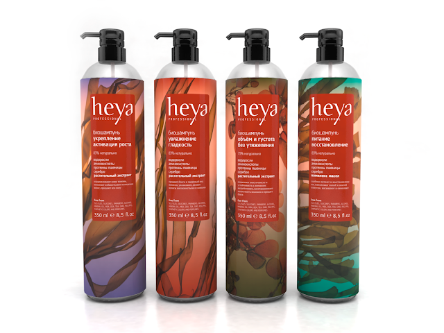
Heya Hair Care Labels Designed By Mikhaylover Valeriya
This Russian company’s packaging was inspired by Japanese art. It uses natural elements such as seaweed, to communicate the natural ingredients of the product. With oils and other natural components, the label would need to be using a durable stock. The WetStick™ label uses a technology which makes it adhere, and not budge an inch. With a label so large, keeping it all intact throughout use will be important.
Learn even more about how our labeling solutions can increase sales. So, download our e-book, The Complete Guide to Innovative Labeling Techniques.

Connect with us on social media!
![]()
![]()
![]()
![]()
![]()
![]()
![]()
![]()