While muted tones can appear rustic and classic on a label, neon colors can make your product pop off the shelf! Not all neon needs to be reminiscent of the 1980’s, in fact, here are some modern designs with neon color schemes without overwhelming the customer.
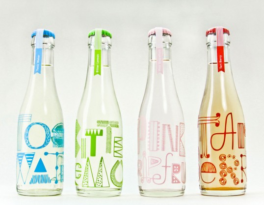
Bottle Labels Designed by Miriam Altamira
Bottle Labels Designed by Miriam Altamira
What’s refreshing about this design is that the bright hues are only used sparingly on the text, which takes up the majority of the label. It makes the image look crisp and draws the focus right to where the designer wants it to go.
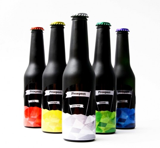
Prospect Neon Beer Labels Designed by Matthew Melling
Prospect Beer Labels Designed by Matthew Melling
Based on the act of prospecting for minerals, this design uses the bold colors and geometric shapes to its advantage. While the design is concise, it also uses the black matte portion of the pressure-sensitive label to really make the glossy finish and neon colors stand out.
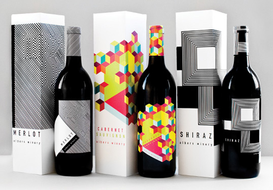
Albers’ Neon Wine Labeling & Packing Designed by Meeta Panesar
Albers’ Neon Wine Labeling & Packing Designed by Meeta Panesar
This label features a more complex usage of bold color. However, the pairing actually pays tribute to “Homage to the Square,” a series of paintings. It also makes effective use of placing the text at irregular angles, adding intrigue to the packaging.
Learn even more about how our labeling solutions can increase sales. So, download The Complete Guide to Innovative Labeling Techniques.

Connect with us on social media!
![]()
![]()
![]()
![]()
![]()
![]()
![]()
![]()