It’s the time of year where pastels are popping up everywhere. This color refresh may be a great way to approach design with a lighter, brighter perspective. Let’s take a look at some labels and packages that use pastels in fantastic ways!
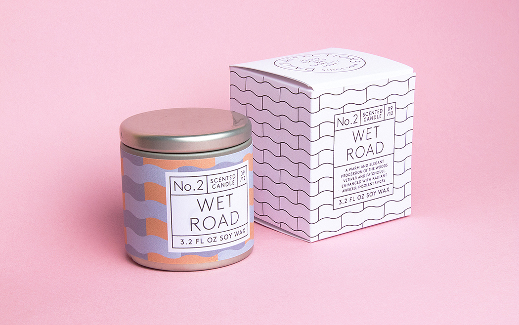
Daily Affections Candle Label & Packaging
Daily Affections Candle Design By Albert Junghwan Son
These candles and corresponding abstract designs are inspired by world around us. Since pastels are calming colors, keeping them on a candle’s packaging could even be somewhat of a color placebo for customers. Either way, this refreshing label design demonstrates that pastels don’t necessarily need to be used in bright, vibrant ways, but rather can also have subtle sophistication.
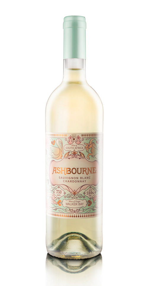
Pearly Yon’s Wine Label
Pearly Yon’s Ashbourne Wine Label
Inspired by the Belle Époque, the use of pastels on this pressure sensitive label naturally evoke a more sophisticated and vintage style. When considering pastels and retro design, the mind goes to the 1950 inspired designs where minty and pink pastels are most common. It’s refreshing that the colors are utilized in an even more dated era with a faded aesthetic and still has a modern twist.
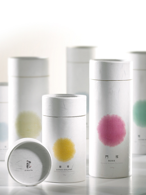
Zi-Chi Tea Label & Packaging
Zi-Chi Design By Angle Visual Integration
This modern, minimalist design is perfectly accompanied by pastel colors which represent the flavor in each container. While some tea packages may take a light, delicate approach, this package uses pastel color in a new, innovative way. Color coding each flavor also builds simple connections with the product.
Learn even more about how our labeling solutions can increase sales. Download The Complete Guide to Innovative Labeling Techniques.
Connect with us on social media!
![]()
![]()
![]()
![]()
![]()
![]()
![]()
![]()