Tis the season to get inspired by snow & ice, right? Snowflakes, blustery landscapes, and icy motifs all help set a tone for your product. This theme isn’t restricted to cold products only. Here is how you can incorporate seasonality into any label design.
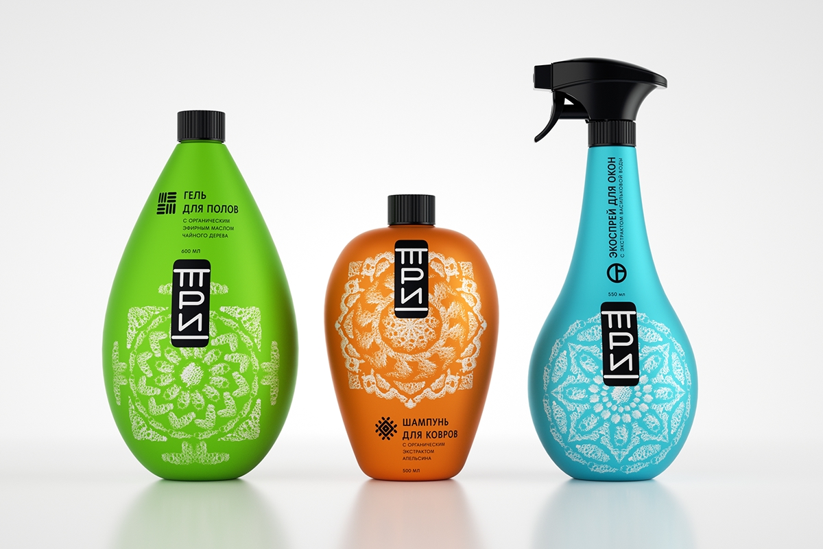
TRI Label Design By Ivan Bravin-Rogov
While these suds form mandalas, not snow & ice, these designs still produce a seasonal effect. This very clean look uses white and the sudsy texture which emulates the way snow looks after being walked in. Again, this is not the intention of the designer but is an inspiring design for something that could look more wintery on your own label. The scale and shape of the design compliment the bottle’s contours. It’s a great way to emphasize the unique qualities of the container. This label could be enhanced with a tactile coating to produce a raised effect. This would create even more interest with the customer once they pick the item up.
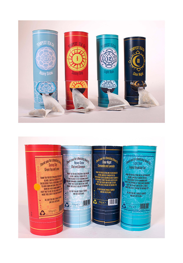
Tempest Tea Label Design By Tori Pickford
The tea flavor, Heavy Snow, is a cinnamon and chai tea blend. This label uses the snowflake motif as an identification marker, but also as a flap where tea can be pulled out from the packaging. Even the background behind that flap is reminiscent of a snowstorm. The color scheme is another effective use of the wintery theme. The white and baby blue hues are complementary to the snowflake motif. It creates a cohesive look.
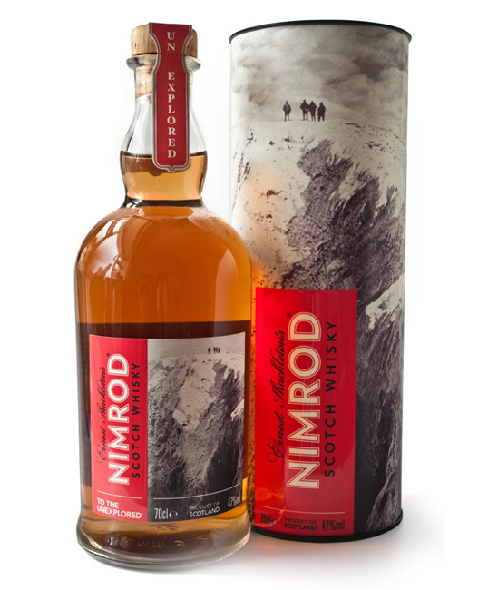
Nimrod Whisky Label & Packaging By Zef Narkiewicz
The packaging design was inspired by whiskey bottles discovered under Antarctic explorer Ernest Shackleton’s hut. It uses a photograph taken of the 1907 expedition, Shackleton went on. What is more on theme than an actual tundra? The tongue in cheek name is effective at creating a story behind the label and commenting on Shackleton’s expedition.
See our labeling techniques in person also. Request free samples to be sent straight to your door.
Connect with us on social media!
![]()
![]()
![]()
![]()
![]()
![]()
![]()
![]()