Soap labels come in a variety of styles, like its packaging, for any industry. It varies depending on product type and demographics. Because of this, there is so much inspirational design!
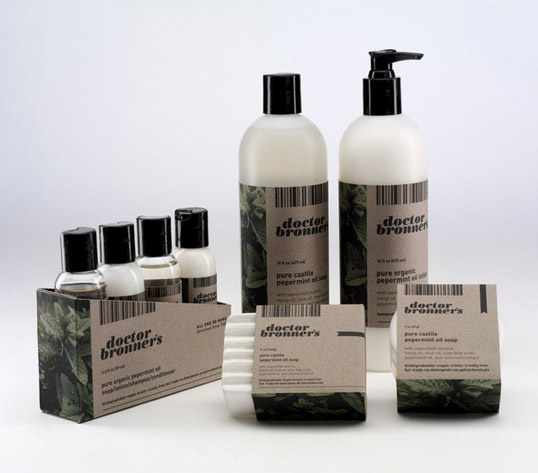
Doctor Bronner’s Soap Labels & Packaging By Tyler Hamilton
Doctor Bronner’s Soap Labels & Packaging By Tyler Hamilton
This label’s dark, natural look is reminiscent of apothecary and organic packaging. The minimalistic nature of the displayed information further helps to draw attention to the leafy design on the side. As seen in the above picture, the design style makes it easy for it to be utilized across the entire line. The dark label also contrasts the light in a sophisticated manner.
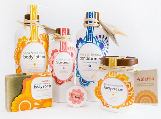
Alaffia By Nicole Chan
Alaffia Body Wash Redesign By Nicole Chan
This sustainable skincare line uses ingredients from West Africa. This redesign focused on having a new, bold look that stands out from other natural beauty brands while keeping an indigenous feel. The various fragrance designs make it easy for each scent to stand out from the next. Even the small lip treat label incorporates the style in a minimalistic way. The tamper-proof label across the top of the containers is a simple way for customers to know that their item is used for the first time.
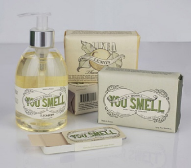
You Smell Soap Labels & Packaging By Megan Cummnis
You Smell Soap Labels & Packaging By Megan Cummnis
What may sound like an insult will leave the customer surprised upon flipping the product over. You Smell then turns into “You Smell like a lemon…thanks to us.” It leaves the shopper intrigued and eager to continue flipping other fragrances for the humorous surprises. The sophisticated style of the label contrasts the insult, adding to the surprise of the joke.
Learn even more about how our labeling solutions can increase sales. So, download The Complete Guide to Innovative Labeling Techniques.

Connect with us on social media!
![]()
![]()
![]()
![]()
![]()
![]()
![]()
![]()