With the Spring season here, and more flowers blooming, bees buzzing, & bugs crawling, I figured it would be a good time to show some label inspiration!
Check out these labels inspired by this Spring season and the Summertime that’s soon to come!
Different, but the same
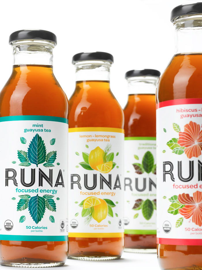
While shopping for juice at the store, seeing this label will urge consumers to pick it up since it quickly shares what flavor you will be enjoying and is inviting by design. It has a current Springtime feel on its label that features different artwork for each flavor of juice, but you can easily spot that it is by the same brand.
Once nectar, now honey
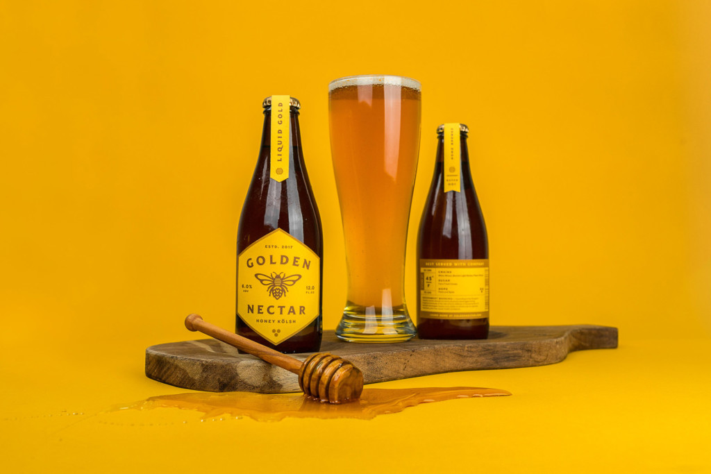
This beer label brings the season of spring right to it, by incorporating honey into its design & ingredients. It utilizes the color yellow like honey, while cleverly using the hexagon shape for its front-facing label, resembling a honeycomb, which everyone immediately associates with bees, honey & spring and summer seasons. If a long day of Spring cleaning, or yard work, doesn’t make you want to go to the store and search for this label to find this beer, I don’t know what will.
A breath of fresh air
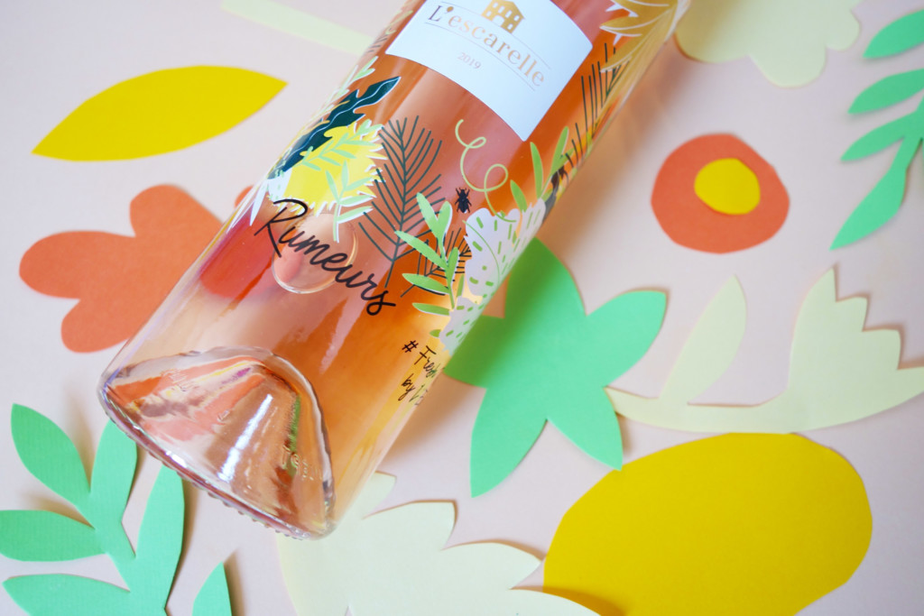
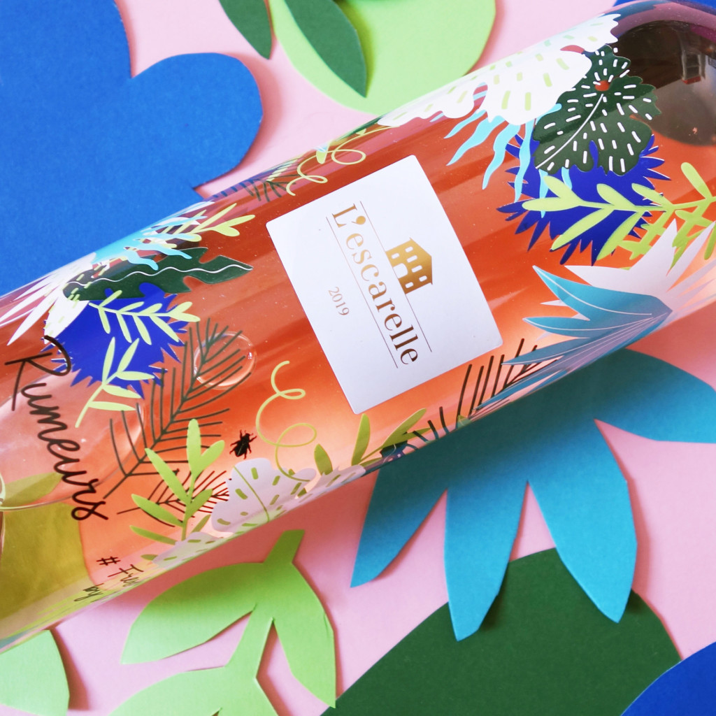
These labels are another breath of fresh air. They allow the bottle to “breathe” with the transparent stock it uses. This is also great for consumers to directly view the product through the label. The flowers, palms, & leaves covering this label help the brand bring the right message to its potential consumers. It lets you know the wine is a lighter, pink wine, fresh & bouncy in flavor.
Facebook | Instagram | Twitter | Website