Your brand is important to consider when designing a label. What are you trying to say about your company and your product? You may be surprised to see how easy it is to fix packaging issues in communicating your brand.
What does this label express to you about your brand?
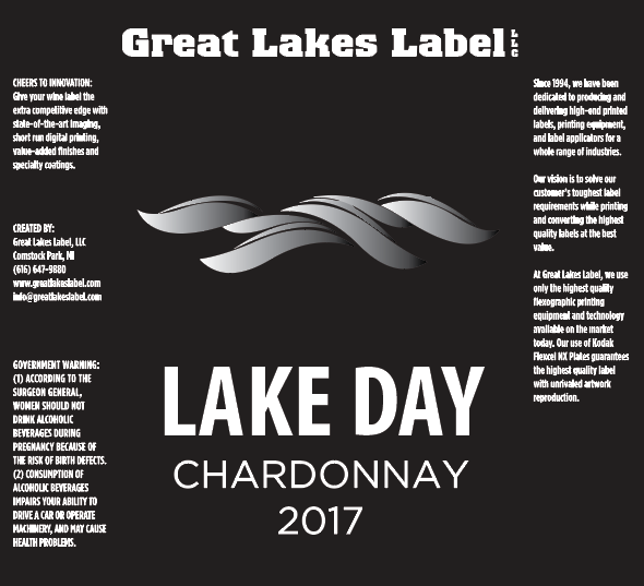
- Classic?
- Traditionally made?
- Luxurious?
- Simple?
The foiled waves and minimalistic design speak volumes about the product and the brand. It sets the tone for a product appealing to a broader audience or those looking for luxury wine. It’s universally pleasing with classic lines.
You may have seen this on our website before…
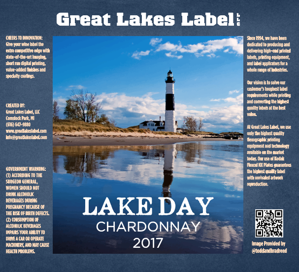
This label conveys a sense of community and handcrafted practices. It even promotes the photographer’s social media handle. Best yet, it also makes it easy to create a line of products when all you need to do is change the background color and photograph. As you can see, the title font is also softer and better suits the branding.
You Don’t Need To Change Much To Change How Your Brand Comes Across
Appeal to the right demographic by considering what their needs are, and what they’re looking for in a product. For Michiganders, the Pure Michigan pride of supporting local photography trumps the more international, sophisticated look. That said, for international products, a Great Lakes touch won’t hit home for most people in Arizona. It’s all about perspective.
This is also where customer feedback comes in handy. Discuss what your label design means to your customers, or, run an A/B test to learn what catches customers’ eyes. Like any good scientific experiment, try changing one element at a time to get a proper understanding of which specific elements work.
Learn more about how we can bring your wildest label design concepts and durability requirements to life. While techniques are important and exciting, there’s so much more to your label. Download our Label Project Guide e-book.
Connect with us on social media!
![]()
![]()
![]()
![]()
![]()
![]()
![]()
![]()