Where nature inspired labels are concerned, wood is a great design. This is because texture can be added to the label in a simple, but effective way. Whether you raise the pattern with tactile screen, emboss the text or add grit coat, you can give your design a realistic edge. Here are some designs that stand out without techniques, but could easily use them to enhance the design.
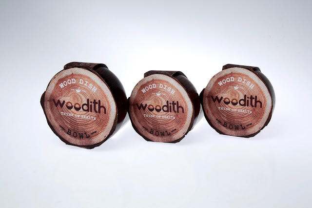
Woodith Wooden Dish Label By Hyojung Jung
Woodith Wood Dish Label By Hyojung Jung
The label was designed to look like a tree stump. It’s purpose is to give off the natural feeling, reminding the customer that their products are environmentally friendly. While this design only uses neutral colors, the contrast and the realistic motif creates a unique look that catches the eye. If tactile coating was used on each ring of the stump, it would take the realism to the next level.
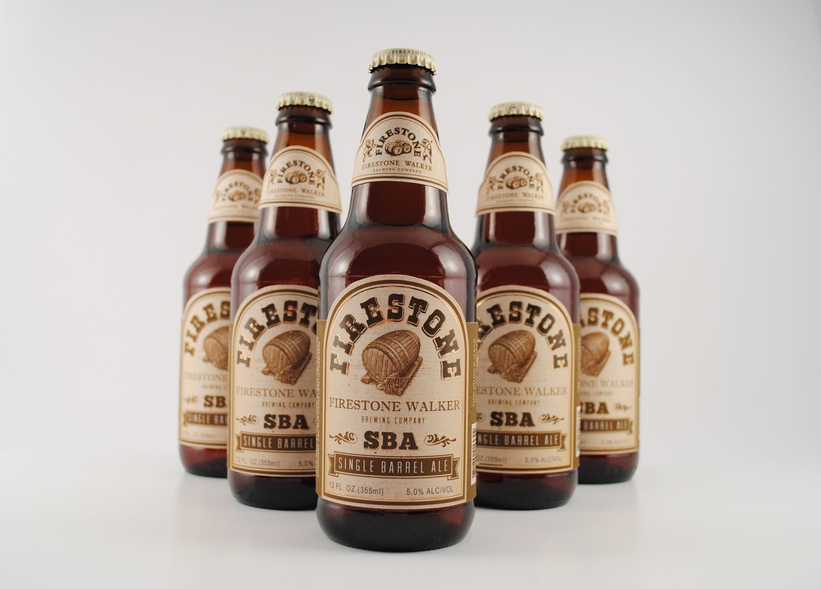
Firestone Beer By Rachel Yan
Firestone Beer Label Designed By Rachel Yan
This label features a wooden barrel, the wine stock for the pressure sensitive label also adds wood-like texture to the design. The title, “FIRESTONE” is also perfectly emphasized with a foiled outline of copper. If you’re targeting a more mature demographic, wood veneers are preferred by the thirty and over crowd. Embossing the barrel would be a fantastic way to make it stand out and compliment the foiling.

PAW Granola By Ali Neilly
PAW Granola Bar Designed By Ali Neilly
This product, aimed at hikers, uses a chipboard design and scouting symbols to connect nature with nostalgia. A simple association that makes the wrapping pop. The neutral wood flakes also allow for the neon yellow title to stand out and draw attention on the grocery store shelf. Adding grit coat to the rough looking wood would be a fantastic way to make the design more realistic.
Learn even more about how our labeling solutions can increase sales? So, download The Complete Guide to Innovative Labeling Techniques.
Connect with us on social media!
![]()
![]()
![]()
![]()
![]()
![]()
![]()
![]()