Housewares’ labels are important for informational purposes, but also for aesthetic purposes. As a result, the design can communicate the brand’s target demographic and it can also work to match that customer’s interior design.
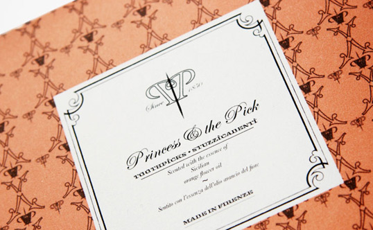
Princess & The Pick Toothpick packaging
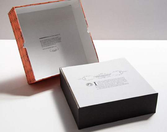
More Princess & The Pick By Amrita Marino
Princess & The Pick Toothpick Packaging Designed by Amrita Marino
Marino’s challenge was to take a product from a 99 cent store and rebrand it as a luxury item. Amrita Marino said, “My research indicated that the toothpick used to be a luxury item in Europe during the Renaissance and simply created a brand based on that idea. I selected the name Princess and the Pick as a tangential reference to the Princess and the Pea, the fairy tale by Hans Christian Andersen. The basic story is that of an Italian princess and her marriage dowry that consisted of scented toothpicks.”
The ornate border, calligraphy style font, and even the minimalistic label all contribute to the luxury look. The contrast of the wallpaper pattern and also the monochromatic label implies victorian era sophistication. So, it plays into the fact that this was a luxury item in the renaissance.
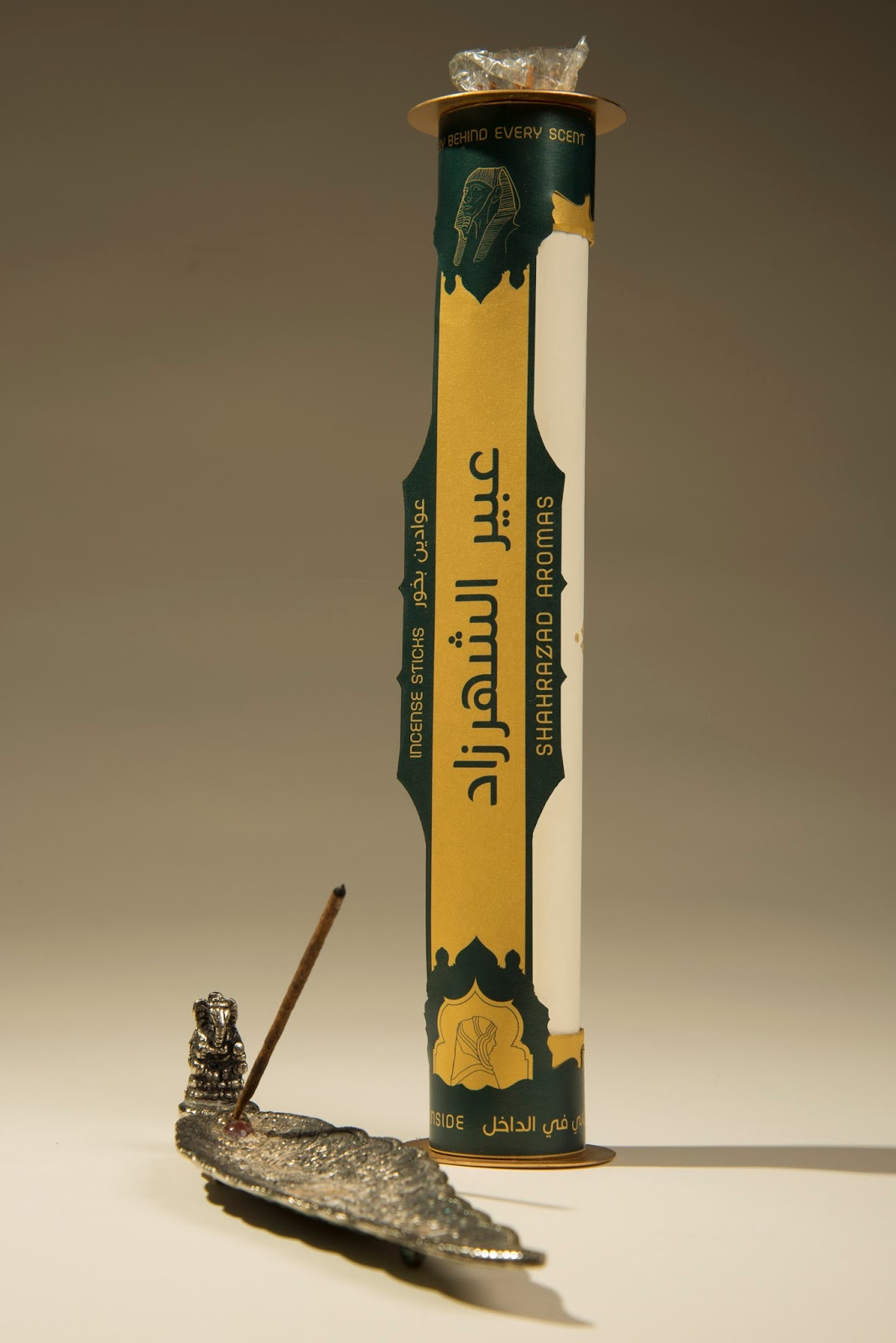
Shahrazad Aromas Incense Sticks By Eric Collier
Shahrazad Aromas Incense Sticks Housewares’ Labels Designed By Eric Collier
This label not only features unique design but a unique shape that lifts off from the packaging as well. The design, inspired by Arabic architecture, uses stunning Arabic calligraphy and a rich color scheme. Inside the packaging is a poster, which unfurls like a scroll. Again, this all-encompassing and immersive design delights the senses and engages customers.
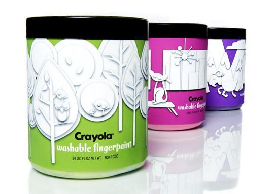
Crayola Concept By Christine Clayton
Crayola Washable Fingerpaint Labels Designed By Christine Clayton
Every painting begins with a blank canvas and big imagination. So, the stark white paper cutouts showcase monochromatic scenery. They emphasize all the magical places this product can take you. The bold coloring stands out on the shelf and from every other product in the line, making it ideal as a children’s product.
Learn even more about label production and design. So, download our e-book. The Label Resource Guide.

Connect with us on social media!
![]()
![]()
![]()
![]()
![]()
![]()
![]()
![]()