Paint labels pose a unique challenge. How do you stand out, while also clearly communicating the color of the product? Whether you take a bold or traditional route, these designs show you how to best merge the two needs.

Dots Paint By Christine Herrin
Dots Paint Can & Spray Paint Label Designed By Christine Herrin
This design incorporates many vibrant colors to create an abstract design that catches the eye. Even still, the color of the paint is apparent based on the lid label and half of the side label. It expertly plays with color and shape to stand out from more subdued paint packaging designs while still clearly communicating what the product looks like.
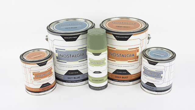
Nostalgia Designed By Matthew Tomoni
Nostalgia Paint Labels Designed By Matthew Tomoni
Perhaps incorporating the ideal name, Nostalgia creates a vintage and clean look to their labels. The color of the product is obvious, and the customer demographic is clear. Tomoni says of the design, “I chose Frank Lloyd Wright and designed my line of paints to mirror different aspects of his work, including but not limited to, his architecture, interior design projects, stained glass windows, and unique color palettes.”
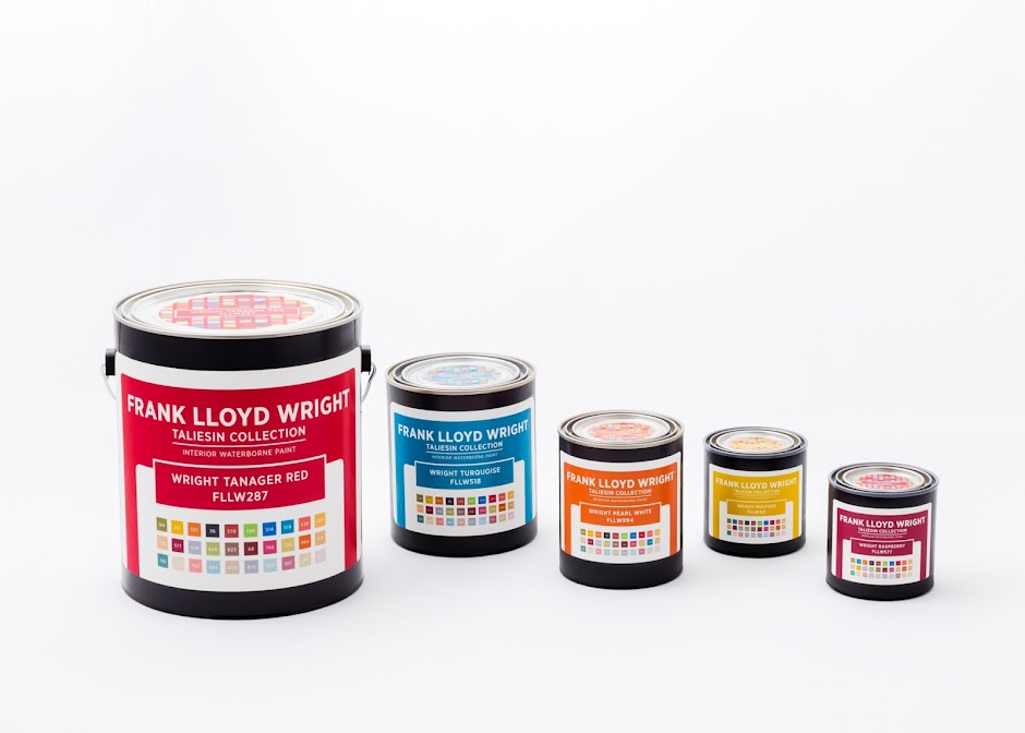
hFrank Lloyd Wright Concept By Ana Paulsen
Frank Lloyd Wright Concept Packaging Designed By Ana Paulsen
This series is another Frank Lloyd Wright inspired design. It also draws upon his architecture, stain glass windows, and interior design projects. As you can see, despite the same source, inspiration can take your design in limitless directions. The color palette at the bottom of the label shows how each color will look against others in the paint collection.
Interested in learning more about how our labeling solutions can increase sales? Download our e-book, The Complete Guide to Innovative Labeling Techniques.

Connect with us on social media!
![]()
![]()
![]()
![]()
![]()
![]()
![]()
![]()