Destiladora de Agave Azul is a Mexican company specializing in quality spirits. Learn more about their production process here. Each one of their products stand apart from the other and fittingly, so do their labels.
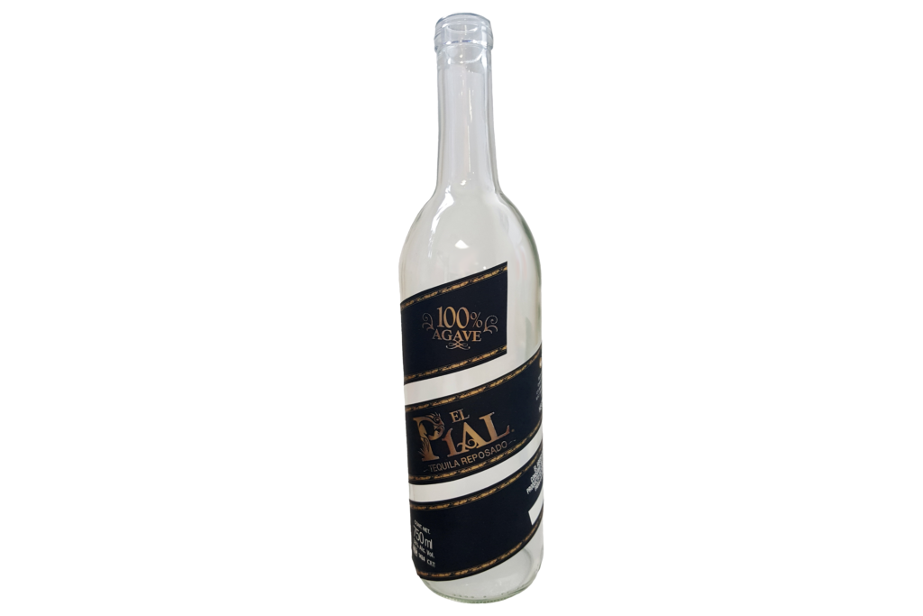
El Pial Destiladora de Agave Azul Label
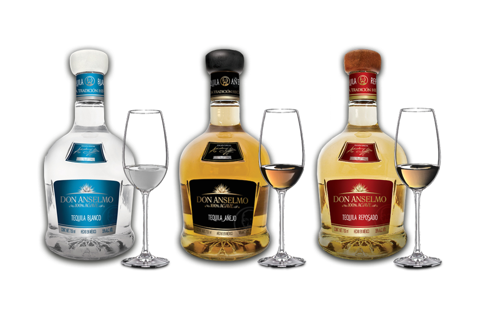
Don Anselmo Destiladora de Agave Azul Labels
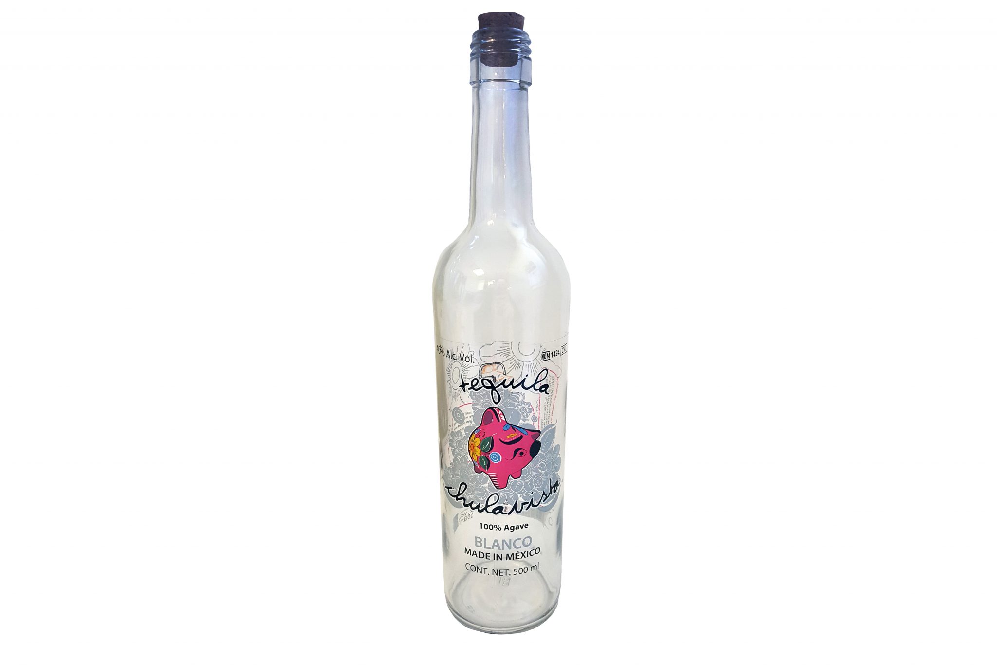
Chulavista Destiladora de Agave Azul Label
Destiladora de Agave Azul’s Versatility In Packaging
As you can see by the images of El Pial, Don Anselmo and Chulavista, each product has a unique look. Not only does this differentiate each product from the other, but it gives customers an impression of what the spirits will taste like. Through label design, you get a sense of the personality of each drink.
El Pial
El Pials’ twisting series of labels lead the customer to pick up the product and spin the bottle for more information. Once customers have the product in hand, they are more likely to make a purchase. While the shape of the label is engaging, so are the embossed and foiled details. Paired with a black background, these techniques create a luxurious, modern, and irresistible look.
Don Anselmo
The three flavors of this product line are emphasized by the three color schemes. Each label features MiraFoil details and embossing as well. The caps top it all off with an elegant touch.
Chulavista
Chulavista uses clear label stock which means, when empty, the labels are clearly apparent from both sides of the bottle. The bold, playful design creates a modern look which stands out from the other product designs. When full, the back label disappears and the front label looks minimalistic.
Learning more about what labeling solutions Great Lakes Label offers and how to incorporate these techniques into your label design. Get label samples to see these techniques in person!
Connect with us on social media!
![]()
![]()
![]()
![]()
![]()
![]()
![]()
![]()