Doodles are major a labeling design trend for 2018. The messy, free, authentic aesthetic says a lot about a product or a brand. What are you conveying with your packaging? For handcrafted and unique product, doodles stand out. Get inspired by these label art concepts.
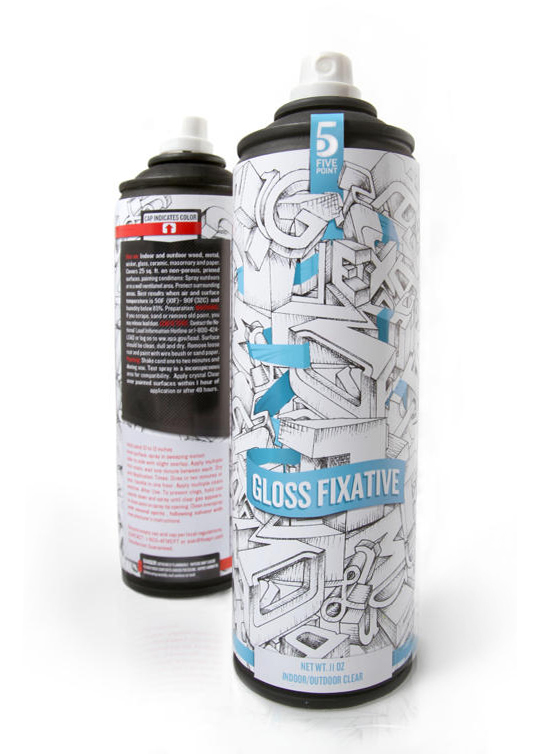
5 Point by Ryan Bosse
5 Point Art Supply Doodles Packaging Designed by Ryan Bosse
Obviously, as an art product, the colorless scheme is designed to attract artists. The incomplete nature also evokes a sense of creation. Anything is still possible. If colored in, every person takes it in a different direction. Gives the design a different mood. So, it attracts the ideal demographic in the grocery aisle.
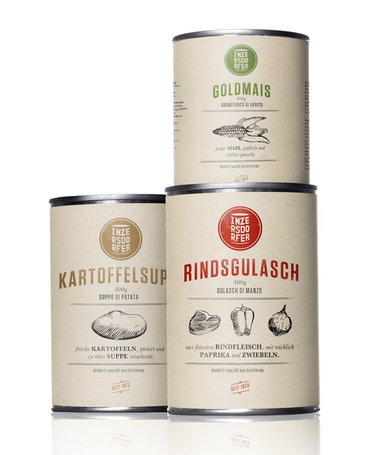
Inzersdorfer by Michael Nagy
Inzersdorfer Label Designed by Michael Nagy
The rougher nature of this design mirrors the raw, natural ingredients inside the can. You can tell there’s a simplicity with the product. So, when a customer picks up a can, they understand the product in seconds. Even the paper label stock provides a natural, vintage touch. The vintage style font also works well with the design.
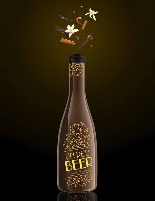
Un Peu Beer by Sanyukta Kothari
Un Peu Beer Bottle Label Designed by Sanyukta Kothari
Unlike the raw messiness of the previous doodles, this design is clean and tidy. So, as I’m sure you’ll guess, it reflects the product and the demographic. The beer is a rich, sweet vanilla and caramel drink that isn’t one to be guzzled. Customers savor this beer. It’s also no surprise that the label design is one that’s free-flowing but also carefully drawn. The intricacy isn’t scribbled down. The lines and color scheme are carefully decided to compliment the bottle, the copy and the product itself.
Learn even more about how we can bring your wildest label design concepts to life. So, download our Label Project Guide e-book.
Connect with us on social media!
![]()
![]()
![]()
![]()
![]()
![]()
![]()
![]()