Ugly food makes for challenging product photography. How do you capture something that tastes wonderful yet looks bland, or worse yet, downright gross? In the grocery aisle, unappetizing images make it easy for customers to pass by, so it’s crucial to ensure your product looks good. Or, find a way to work around the expectations of product photography for your product. A creative compromise could simply be more effective than sticking to what is standard. As a result of choosing a new direction, your product may just stand out against your competition on the shelf.
Helpful blogs on related topics:
- All About Product Photography
- Customers’ Food Labeling Preferences
- Capture Short Attention Spans With Strong Label Design
- Do Light Colored Labels Equal Healthier Products?

“Ugly Food” is Objective
What looks appetizing to one person, may not to another. Or, what seems perfectly normal to some, may also appear disgusting to others. Your brand’s biases also come into play. Make sure you test your labels or even try A/B testing to learn what it is exactly that is turning shoppers away. If the results are negative every single time, consider a creative approach or a strategic compromise. There are still ways to promote your product on the label, however, it does require a new perspective. When rerouting like this, it helps to consider the values of your brand, and this product, offer customers.
Avoid Picturing It Completely
When in doubt, scrap the product photography. Let’s say, for example, you’re working with an unpleasant looking brown soup. If it’s not testing well, and if it’s turning people away, then the picture needs to go. Some soup companies take this route, using a classic, pictureless design that creates a welcoming sense of nostalgia. Many shoppers don’t need to see a picture of the soup to envision it anyway. So, the nostalgia establishes the home cooked feel, the nostalgic memories, and the brand’s longtime presence in grocery stores to make up for a lack of an unappetizing picture. What does your brand offer that can be communicated in place of the photography?
Hint At It With Images of The Ingredients
One option, often seen with smoothies, is to show pictures of the fruits and vegetables used inside. Again, this establishes brand values and communicates that good, wholesome ingredients are incorporated into the product. Frequently, minimalistic and transparent labels are used to show off the product as well. So, no product photography is needed to allow customers to look straight at the juice inside. Ugly food isn’t a hindrance in this case since it serves a valuable purpose. Almost like the uglier it is the better it is for you.
Dress The Product Up a Little
Let’s go back to the soup for a second. Okay, so you really want to show the actual product on your label. Maybe the portion of the soup could be smaller, with a cute herb sprig, in a cute bowl, surrounded by delicious looking bread. Make the rest of the image so cozy and welcoming that the ugly product itself looks welcoming as well. Subconscious connections are made in milliseconds, so take advantage of every inch of space in your image. Once shoppers emotions are engaged, the positive feeling will inspire them to try your brand’s item.
Innovative Labeling Techniques
Guide eyes away from the unappetizing elements by highlighting tasty elements. Consider horned melon for a second. The green innards, the yellow/brownish spikes, and the wrinkly texture of the skin are somewhat unappetizing to look at. However, it’s all about how you show it off. Use foiling to make the green shine inside. Or, use a tactile coating so the shoppers actually want to reach out and touch the pre-historic looking peel. Then emboss the horns so they stand out. Engage the senses in new and interesting ways to captivate your customers, but also to appeal to their tastes.
Labeling Technology
Use NFC (Near Field Communication), hashtags, or QR codes to link customers to useful recipes. So, while the product may not spark an interest right away, the desire to try something new in the kitchen will. Even the fact that the brand clearly creates value beyond the grocery aisle helps. Hashtags also provide shoppers with a link to the community of people who follow your brand and use your products.
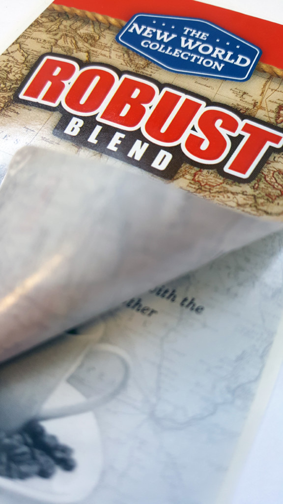
Booklet-Style Labels Offer Flexibility
Bury pictures to the inside of the label instead of featuring it front and center. Shoppers still see the product, but there’s more control over the first impression of it. Plus, it engages customers enough to open it up and once the item is in their hands, they’re more likely to make a purchase. This also provides an opportunity to offer even more value in your label design on the inside panels.
Embrace The Ick Factor
Kids packaging and promotional Halloween packaging both benefit from gross looking food. There’s an appeal to the shock of it. Alternatively, the “tastes good, looks gross” approach keeps things honest and infuses humor into label design. Of course, this route is ideal for laid-back brands whose humor is part of their added value. Still, it’s useful to consider how humor diffuses the situation and makes shoppers want to learn more.
Learn even more about how we can bring your wildest label design concepts and durability requirements to life. While techniques are important and also exciting, there’s so much more to your label. Download our Label Project Guide e-book.

Connect with us on social media!
![]()
![]()
![]()
![]()
![]()
![]()
![]()
![]()